 Let’s hope that doesn’t devolve into ars moriendi very soon. We’re told the blog is on its way out — maybe has already been hit in the butt by the door — because humanity so captivates itself with 140-character bursts of “content.” Personally, I like writing blog posts and I like reading them. It’s a lot like writing a Pepysian journal, only with an audience that can talk back.
But I also happen to like reading newspapers. And look what’s happened to them…
There’s more to blogging than blurbing. The blog is a perfect platform for various kinds of long-form writing — not only journal-like or epistolary entries, but reportage, investigative journalism, serious essays, even stretches of fiction or poetry. None of these (except possibly haiku) are accomplished in 140 characters.
Google, in its determination to dictate the shape of the future right down to the last pixel, may very well have delivered the coup de grâce to the blog as a functional genre. Not everything fits on a cell-phone screen — even Apple figured that out when they came up with a larger iPhone. A newspaper does not feel adequate when it’s shrunk to the size of a tabloid. A magazine continues to hemorrhage readers after it turns itself into a website. Books gain popularity when sold cheaply in Kindle format and gates open for amateur self-publishers, but publishers of quality products go under and, in the absence of gate-keepers, we’re so swamped with schlock that no one takes a published book very seriously anymore.
The medium, in a word, is the message.
IMHO, Google’s demand that every website, no matter what its subject matter or what its genre, must fit on a tiny mobile screen — or else Google will effectively disappear it — could very well amount to a final blow to blogging, at least in its long form. Narrow a column, shrink the size, and pretty soon your readers feel like they’re reading toilet paper. It changes their experience of your writing, and that change surely could be perceived as negative.
And it doesn’t take much “negative” of any kind to drive readers away from an electronic medium.
A blog devoted to publishing the written word, I suspect, is not something that is easily read on a smartphone.
As in print publishing, the physical look of the product is as important as the content — maybe even more so. That’s why we have (or had…) graphic designers, whose skills are every bit as crucial to a published work as the writer’s and the editor’s. People bought Arizona Highways and National Geographic and Life Magazine and Playboy for the sensual experience of handling those publications as much as for the pleasure of reading and viewing professional photography.
Have you taken a look at the incontrovertibly “mobile-friendly” blog themes out there? Notice something funny about them?
At base, there really are only about four, maybe five underlying design structures for these things. They all look the same. After you’ve seen four of them, you’ve seen them all. Most of them have only one or two columns — very few have three. Most of the two-column numbers will disappear key widgets from your sidebar, either creating more hassle for you as you figure out how to bring them back or simply eliminating those elements from your blog. Some relegate widgets to the bottom of the page, widgets that you — knowing where most readers’ eyes go in the milliseconds after a website loads — put into a sidebar for a reason.
Effectively, Google has arrogated the design of your site away from you, away from your designer, unto itself.
And why not? It already arrogated the privilege of advertising on your website to itself.
Google the search engine may be a handy tool, but, my friends, Google Inc. is not our friend.
Well, I’ve tried a number of them and have made all of my sites compliant with the new demand.
The Copyeditor’s Desk, to my mind, does in fact look better in its new duds, the old WordPress Twenty-Twelve theme.
Adjunctorium, gussied up in Shaped Pixels, is OK. I guess. Still have to figure out how to get a “subscribe” widget in there but simply do not have the patience to fiddle with it anymore. I’m not nuts about the punkin orange links — dislike orange type in general. Probably I can get in there and change the link color…but this little project has already consumed enough time, thank you.
Writers Plain & Simple, which is hosted on WordPress.com, is still wearing Chateau, as is Plain and Simple Press. At one moment Google’s accursed “tool” claims the thing is mobile-friendly; at the next, not so much. If you enter writersplainandsimple.com, for example, you get a stupid “AWESOME” message, Google apparently assuming we all speak like Valley girls and are so kewl with this accolade. If you enter the true, behind-the-scenes URL, writersplainandsimple/wordpress.com, then Google gives you a raspberry.
It might make some sense to switch both of those sites to the antiquated (but at least still viable) Twenty-Twelve theme. But I’d need to come up with another image. I guess I could re-use the “books” image I knocked off for The Copyeditor’s Desk, but I don’t think it’s cropped to the right size (notice how the change deep-sixed my cool little black feather pen, for which I paid a designer freaking royally?).
But you know, I’ve already wasted enough time on this.
What a pointless time suck!
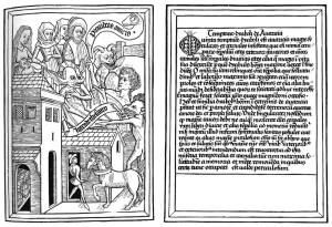
Image: Pages from an ars moriendi.

